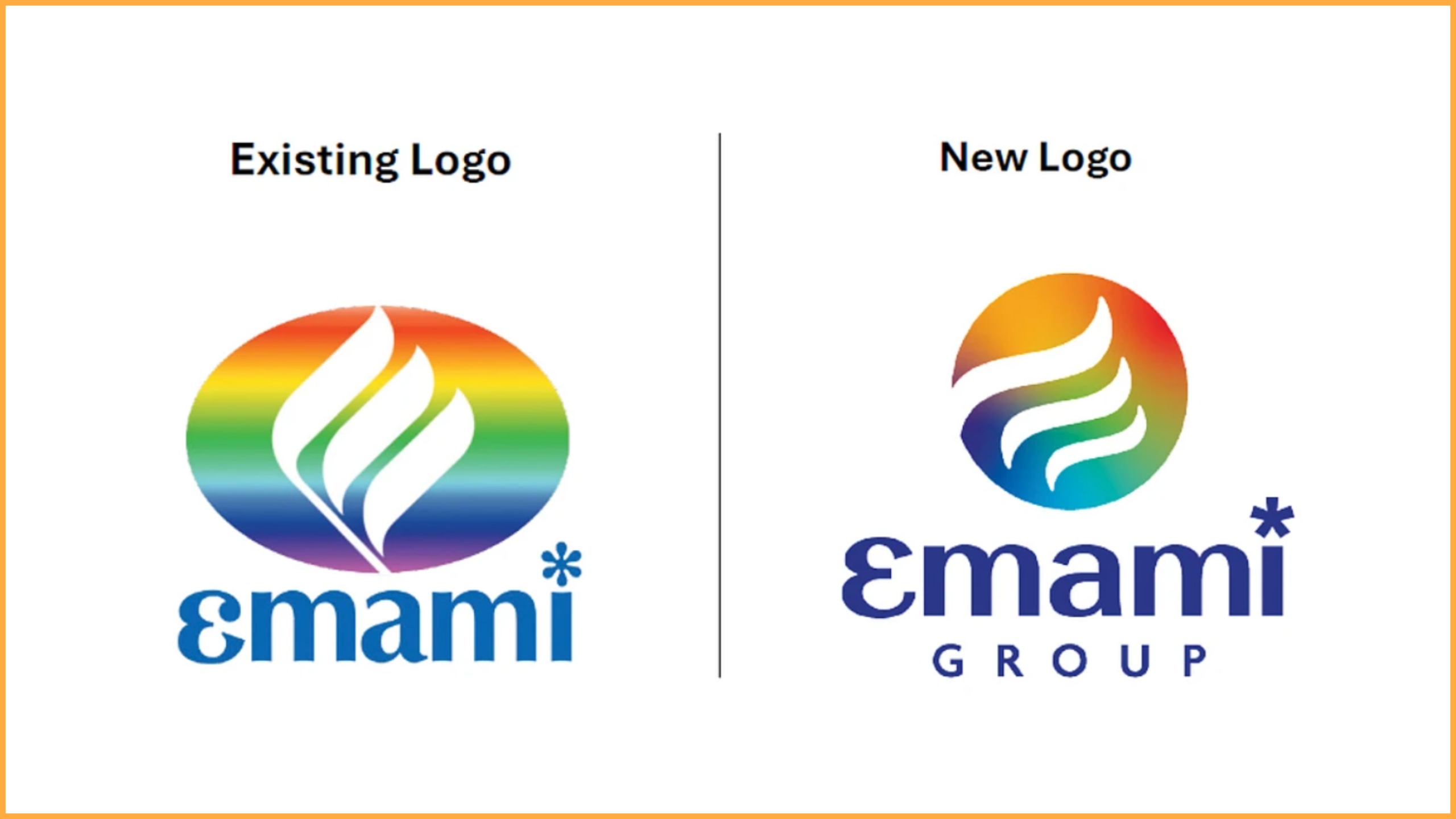
Emami has just revealed a striking new corporate identity that blends its rich legacy with a contemporary design language. The update comes as a part of the brand's vision to stay rooted in its values while adapting to the evolving business landscape both in India and abroad.

The most notable change is the transition from an ellipse to a globe-inspired sphere. This shift represents a mindset that is agile, adaptable, and prepared to take on global markets. At the heart of the new emblem is a stylised 'e' symbolising the company's commitment to progress, reinvention, and sustained excellence. The updated design also includes a refined colour palette and typeface that gives the brand a sleeker, more modern appeal.
This transformation is not just cosmetic. Emami is aligning every arm of its business under this unified identity. Each division will carry a version of the refreshed logo and visual language, tailored to its category while maintaining consistency with the master brand. The complete rollout is expected to take place over the next few months.

Harsha Vardhan Agarwal, vice chairman and managing director of Emami, called this a defining moment. “Our new identity captures everything Emami stands for today. We are a business deeply rooted in tradition but powered by innovation, diversification and a global perspective. This identity signals our readiness for the future and reinforces our promise of delivering quality and value-driven solutions across categories,” he said.
ADVERTISEMENT
With this move, Emami is not just changing how it looks it is making a bold statement about where it is going. The rebrand positions the company to engage more meaningfully with today’s consumers and partners who value both authenticity and modernity.
Follow Marketing Moves on Instagram and Facebook for more brand transformations, campaign deep dives, and everything shaping the world of marketing.