A ninety three year old newsroom just gave its print edition a modern spine. The Indian Express has rolled out a refreshed design that reads faster, guides the eye with generous white space, and frames each story with clear boundaries. The masthead is cleaner. Type is bolder. New panels add structure so a reader can find the right story without hunting.
Form follows an editorial rethink. The team studied how audiences actually use the brand across print, e paper and the app. The finding was simple. Readers come for original reporting, long form investigations, expert explainers and strong opinion. The new layout upgrades that mix. Editorial and Ideas now carry up to seven opinion pieces instead of two or three. Every section commits to at least one special or exclusive story each day. Explained grows into a standing bridge between the newsroom and subject experts so complex issues can be entered quickly and understood fully.
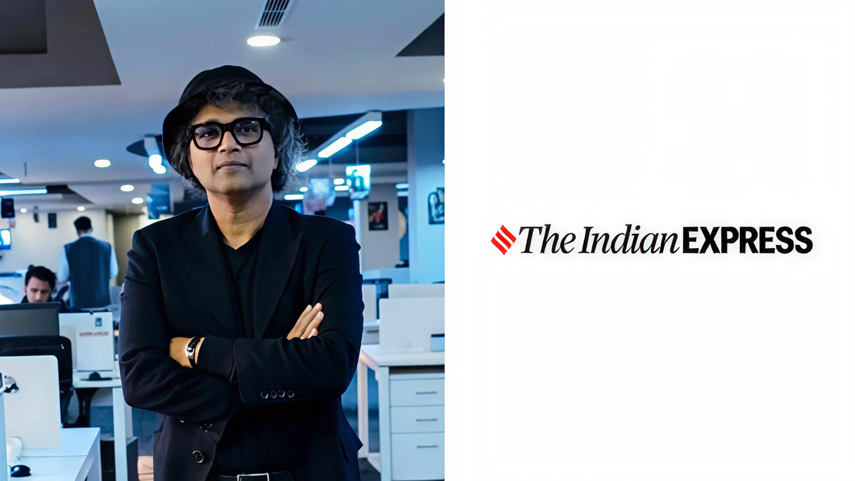
Chief editor Raj Kamal Jha frames the brief in one line. Give readers more of what they value in an easier read. The approach respects a changed habit loop. People already know headlines before bed. They return in the morning for why it matters and what lies beneath. The redesign makes that path shorter. Deeper stories sit higher on the page. Entry points are clearer. Hierarchy is thoughtful so a busy reader can jump between quick updates and deep pieces without losing context.
ADVERTISEMENT
The project is proudly homegrown. Each desk worked with design and editorial to decide how its subjects should live on the page. The choice signals culture. A redesign is not decoration. It is a visible statement of values. When a newsroom owns the exercise, the result aligns with what reporters and editors believe the paper must do every day.
Relevance is the real battle and print has a unique asset. Serendipity. A page can surprise in a way feeds rarely do. You open the paper for one story and discover another that widens your view. The team is betting on that feeling as a loyalty engine. The paper also keeps a promise that screens often dodge. Daily accountability. When mistakes happen, the correction is part of the product, not an edit that vanishes into a timeline.
The refresh lands as the brand broadens beyond borders and devices. Nearly ninety five percent of online consumption is on mobile. About a quarter of total readership is now outside India across the diaspora and a global audience that looks to the title for a window into politics, economy and society. The e paper remains small in absolute size but important in loyalty. These readers often have a history with the physical product and expect the same clarity in the digital replica.
ADVERTISEMENT
This is the first major overhaul since 2014 when Explained and Ideas were formalised. Before that the masthead changed in 1996. Competitors have also moved toward layouts that borrow from digital scrollytelling. The Indian Express response is less about trend and more about fit. Print and digital now share a common design language across core sections like Politics, Explained and Opinion. The experience should feel connected so identity travels from page to phone without confusion.
What to watch next. A visible cadence of investigative calendars. A steadier flow of specials anchored by data and documents. A stronger handoff from print to e paper to app so a long read can be saved, shared and returned to later. For advertisers the upside is a page that reads cleaner and holds attention, which improves time spent with premium environments around exclusives and explainers.
Bottom line. The Indian Express has used design to make its promise easier to keep. Clearer pages. Deeper choices. A consistent voice across print and screen. In a noisy news cycle, that combination is how a legacy brand stays current without losing its centre.
Follow Marketing Moves on Instagram and Facebook for newsroom playbooks, print to digital design checklists and launch teardowns you can plug into your roadmap.